Primary system icons used across components — rendered as 1.5px stroked line icons in a 24×24 viewBox.
UI Glyphs
Chevron Down
Chevron Up
Arrow Right
Arrow Left
Arrow Down
Arrow Up
Plus
Minus
Close
Search
Play
Pause
Stop
Skip Forward
Skip Back
Volume
Mute
Fullscreen
Check
Responsive Grid Behavior.
A single, continuous grid scales fluidly across every device tier — not three isolated mobile / tablet / desktop layouts. Container widths grow predictably while column counts and gutters step up only at meaningful inflection points: 4 → 8 → 16 columns, 16px → 24px gutters.
The 8-Point Grid System
Eight is the smallest unit that divides cleanly into every container, gutter, and component spacing token in the system. Working in 8s gave the team a single rhythm — visual hierarchy, structural alignment, and developer hand-off all converged on one increment. The result: a layout that holds together at any breakpoint without exception lists or special cases.
Removed
Maximum
16 col · 24px gutter · 1648px
XL
16 col · 24px gutter · 1264px
Large
16 col · 24px gutter · 1136px
Medium
8 col · 16px gutter · 688px
Small
4 col · 16px gutter · 368px
Minimum
4 col · 16px gutter · 328px
Breakpoint Gallery
Six page-level screenshots from the live site, each shown at a width proportional to its container token. The faint vertical bands overlay the 8-point grid columns at the count and gutter that breakpoint resolves to (4, 8, or 16 columns; 16px or 24px gutter).
Maximum≥ 1920px · 16 col · 24px gutterXL≥ 1440px · 16 col · 24px gutterLarge≥ 1280px · 16 col · 24px gutterMedium≥ 768px · 8 col · 16px gutterSmall≥ 416px · 4 col · 16px gutterMinimum< 416px · 4 col · 16px gutter
Breakpoint Specification
Each spec bar’s width is proportional to that breakpoint’s container token, so the ramp is visible at a glance. Minimum is the narrowest sliver; Maximum stretches the full row.
Column structure at each tier, rendered with margin and gutter dimensions called out. Alternating fills mark the column rhythm.
4-column grid
16px gutterMarginMargin
Used at MINIMUM and SMALL breakpoints.
8-column grid
16px gutterMarginMargin
Used at MEDIUM breakpoint.
16-column grid
24px gutterMarginMargin
Used at LARGE, XL, and MAXIMUM breakpoints.
Behavior Notes
Gutters hold at 16px through Medium and step to 24px from Large up. The reasoning is density: on phones and small tablets the system wants tighter horizontal rhythm so content earns its space, while desktop and ultrawide compositions need the breathing room or modules start to feel cramped.
Column count doubles at each major tier — 4 at Minimum and Small, 8 at Medium, 16 from Large up. Doubling means a layout authored once at any tier redistributes cleanly to the next without requiring custom rules. A 4-up card set at Medium becomes 8 cards at Large by halving each card’s span.
Containers cap at 1648px on Maximum. Beyond that, the page holds its center and grows symmetrical outer margins so content never feels stranded on ultra-wide displays. Hard-stopping the container is what separates a system that scales from a system that just stretches.
Two timing curves carry the entire system. Every transition, hover, expand, and reveal resolves to one of them. Five duration steps cover everything from instant state changes to scroll-triggered hero reveals. The rule: animate intent, never decoration.
Timing Curves
Two ease functions. The first handles micro-interactions where the user expects an immediate response. The second handles content reveals where weight matters more than speed.
Five steps. Pick by the size of the thing moving and the user’s expectation. Smaller affordances animate faster; larger reveals get more weight.
STEP
VALUE
USE
EXAMPLE
INSTANT
0s
Pure state changes — no animation
Disabled state, theme toggle paint
QUICK
0.15s ease
Tactile feedback, button press
Disc fill on play button hover (1.0 → 1.14)
STANDARD
0.25s ease
Micro-interaction, hover state
Underline reveal, label float, chart bar opacity
SMOOTH
0.45s cubic-bezier(0.32, 0.72, 0, 1)
Content reveal, panel slide
Dropdown panel expand, accordion open
DELIBERATE
1s ease
Hero reveal, page-level entrance
Curtain reveal on image block scroll
Principles
Animate intent, never decoration. Every transition has to communicate something the static frame can’t — a state change, a relationship, a direction. Decorative motion erodes trust on a financial site faster than almost any other failure mode.
Match duration to UI scale. A button hover at 0.45s feels broken; a hero reveal at 0.25s feels jittery. The duration scale exists to remove that judgment call — pick the step that fits the size of the thing moving.
Always honor prefers-reduced-motion. The Curtain Reveal, Parallax Image Block, and any other animation lasting longer than 0.25s render as a fade or skip the animation entirely when the user has opted out at the OS level.
Implementation Reference
TOKEN
VALUE
NOTES
--bx-motion
0.25s ease
Default for all hover/focus/state-change transitions
--bx-motion-smooth
0.45s cubic-bezier(0.32, 0.72, 0, 1)
Smooth ease for panel + content reveals
@media reduced-motion
animation: none / opacity fade
Honored on every animated component
Token Architecture.
Three layers, in cascade order. Primitive values feed semantic aliases, which feed component-bound bindings. A change at the primitive layer propagates everywhere automatically; a change at the component layer is surgical and contained.
The Cascade
Each layer has one job. Primitives are raw values, no semantics. Semantic tokens give those values a name that describes intent. Component tokens bind a semantic token to a specific UI element so engineering knows exactly what to consume.
Layer 3 · Component
Bound to a specific component. Engineering consumes these directly. Changing a component token affects only that component.
A button’s background traces back to a single primitive. Change --ui-black from #000000 to #0A0A0A and every button across the system updates — without touching component code.
LAYER
TOKEN
RESOLVES TO
COMPONENT
--bx-button-primary-bg
Used by .bx-filled-cta::before
↓
resolves to
SEMANTIC
var(--bx-fg)
Theme-aware foreground
↓
resolves to
PRIMITIVE
var(--ui-black)
#000000
Distribution Formats
Tokens are authored once and exported to every consumer downstream. The same source generates CSS for the web, JSON for Figma Tokens Studio, and a JS module for the React component library.
CONSUMER
FORMAT
EXAMPLE
WEB (CSS)
CSS Custom Properties
:root { --bx-fg: #000; }
FIGMA
Figma Tokens Studio JSON
{ "fg": { "value": "#000" } }
REACT
ES Module export
export const fg = "#000";
iOS / ANDROID
Style Dictionary plist / xml
Generated via build pipeline
Accessibility.
Conformance audited at design time, not after launch. Every component carries documented contrast, focus, keyboard, and screen-reader behavior. WCAG 2.1 AA is the floor; AAA where the type scale allows.
Compliance Standards
STANDARD
SCOPE
STATUS
WCAG 2.1 AA
Color contrast, keyboard, focus, ARIA, alt text, error identification
Conformant
WCAG 2.1 AAA
Higher contrast (7:1 normal, 4.5:1 large), no time limits, sign-language alternatives
Partial — mono pairs hit AAA; color viz pairs hit AA
ADA TITLE III
U.S. financial-site accessibility
Conformant via WCAG 2.1 AA
SECTION 508
Federal procurement / institutional reporting
Conformant
SEC ACCESSIBILITY
Investor-facing financial disclosures
Conformant
Contrast Ratios
Every text-on-background pair documented in the system, audited against WCAG 2.1 thresholds. Normal text needs 4.5:1 (AA) or 7:1 (AAA). Large text (18pt+ or 14pt+ bold) needs 3:1 (AA) or 4.5:1 (AAA).
PAIR
SAMPLE
RATIO
AA NORMAL
AA LARGE
AAA NORMAL
FG / BG (LIGHT THEME)
Aa
21 : 1
Pass
Pass
Pass
FG / BG (DARK THEME)
Aa
21 : 1
Pass
Pass
Pass
VIZ TEAL / WHITE
Aa
5.4 : 1
Pass
Pass
Fail
VIZ NAVY / WHITE
Aa
9.1 : 1
Pass
Pass
Pass
VIZ NEGATIVE / WHITE
Aa
5.7 : 1
Pass
Pass
Fail
VIZ MUTE / WHITE
Aa
5.7 : 1
Pass
Pass
Fail
Focus States
Every interactive element receives a 2px solid currentColor outline at 4px offset on :focus-visible. The outline is drawn outside the element’s box, never replaces a border, never relies on color alone.
OUTLINE2px solid currentColor
OFFSET4px (away from element)
TRIGGER:focus-visible only (not :focus)
RATIO3:1 against any background
Keyboard Navigation
All interactive components are reachable, operable, and understandable via keyboard alone. Tab order follows visual reading order; arrow keys handle composite widgets.
KEY
ACTION
WHERE
TAB
Move focus forward
All interactive elements
SHIFT + TAB
Move focus backward
All interactive elements
ENTER / SPACE
Activate focused element
Buttons, links, checkboxes, tab buttons
← / →
Navigate within tablist
Tabs, sub-nav, carousel pagination
↑ / ↓
Navigate within listbox
Dropdown options, accordion items
HOME / END
Jump to first / last item
Tablists, carousels, listboxes
ESCAPE
Dismiss / close
Modals, dropdowns, lightboxes, video player
Screen Reader Patterns
Semantic HTML first; ARIA only where the platform falls short. Every dynamic update announces via a live region; every decorative SVG is hidden via aria-hidden="true"; every form field is programmatically associated with its label.
<label for=> or aria-labelledby; required announced via *
Sign-up form, country select
LIVE UPDATES
aria-live=“polite” on readout regions
Donut hover readout, map state readout
Validation Methodology
Accessibility validation ran during the audit phase, not as a launch retrofit. Color contrast was verified against every documented foreground/background pair before any component was built. Keyboard tab order was prototyped in plain HTML before component scaffolding.
Automated checks via axe-core ran on every component spec page; manual VoiceOver and NVDA passes covered tab navigation, dynamic announcements, and form error states. The Squarespace deploy adds a final layer — the artifact is validated against Code Block injection rules before publish.
Data Visualization
Chart and graph patterns for the BX system. Marks render with currentColor so visualizations auto-invert across light and dark themes. Stat figures use Sanomat; data labels and axes use Guardian Sans 11px / 12px uppercase to match the eyebrow scale. All sample data shown below is synthetic and illustrative only.
Stat Block (KPI)
Single-figure callouts. Used to anchor a hero section, summarize a fund, or highlight a milestone. The figure is the loudest thing on the page; everything around it is in service of the number.
USE WHENA single number tells the story (AUM, count, percentage)
AVOID WHENThe number requires context that won’t fit in a label
FIGURE TYPESanomat 56/64
DELTAOptional, Guardian Sans 14, with up/down arrow
Series A$248B+12.4% YoY
Series B1,240+340 vs prior
Series C9.2%−0.6 pts
Series D62No change
Two-Bar Delta (Annotated)
Two-point comparison with an annotation arrow showing the magnitude of change. Common BX investor-deck pattern (“Adoption Gaining Momentum”, “10-Year Endowment Returns”). The Sanomat figure on the arrow IS the takeaway.
USE WHENTelling a single before/after story with a hero number
AVOID WHENMore than 2 data points needed — use a normal bar chart
Categorical comparison across a small set of items. The eye reads bar heights left-to-right as ordered categories or as a time sequence (Q1–Q4, 2020–2024).
USE WHENComparing 4–12 categories with short labels
AVOID WHENToo many categories (use horizontal) or a continuous trend (use line)
BAR WIDTH~60% of column width, equal gaps
VALUE LABELSAbove each bar, Guardian Sans 11
Bar Chart — Horizontal
Same comparison logic as vertical bars, rotated 90° so long category labels can read at a normal angle. Use this when item names are sentence fragments or proper nouns.
USE WHENCategory labels are long, or you have 8–20 categories
AVOID WHENCategories represent time — vertical reads time better
BAR HEIGHT~60% of row height
SORT ORDERDefault: descending by value
Bar Chart — Mixed Sign (Pos/Neg)
Bars on both sides of a zero baseline. Positive values render in primary teal; negative values render in red. The BX “Not All Real Estate Is Created Equal” pattern.
USE WHENSome categories beat zero / a benchmark, some miss
AVOID WHENAll values share a sign — standard bar reads cleaner
POSITIVEvar(--bx-dv-pos), value label above bar
NEGATIVEvar(--bx-dv-neg), value label below bar
Bar Chart — Phased
Vertical bar series split into two narrative phases by hue, with a baseline arrow callout showing the magnitude of growth across the full horizon. Bottom banner labels demarcate the two phases; the Sanomat figure on the diagonal carries the takeaway.
USE WHENA trend has two distinct narrative phases (driver A → driver B)
AVOID WHENNo phase shift — standard vertical bar tells the same story
Three-bar comparison where one bar carries an accent fill to draw the eye. Used when the takeaway is the gap between an outlier and the comparators, not the full distribution.
USE WHENOne value is the story; the others are context
AVOID WHENAll values matter equally — use the standard vertical bar
COMPARATORSLight-gray fill (var(--bx-dv-mute))
ACCENTNavy fill (var(--bx-dv-c3))
Line Chart
Two-series trend with a top-left legend and hero Sanomat values pinned to the right edge at each line's terminal point. The takeaway figures sit larger than anything else on the page so the eye lands there first; the lines are the supporting evidence.
USE WHENA long-horizon two-series trend has a clear winner
AVOID WHENEither series alone tells the story — use a single line
LEGENDTop-left, 28×3px swatches + sans 14/21 labels
END-LABELSanomat 64/64, currentColor, pinned at terminal y
Section title with a longer descriptor
Caption sub-line
Series Primary
Series Comparator
Series Primary
$796k
Series Comparator
$386k
Area Chart
Same shape as a line chart, with the area beneath filled at low opacity. Reads as cumulative magnitude over time. Use when the magnitude under the line carries meaning (totals, volume).
USE WHENMagnitude (area) is meaningful, not just the trajectory
AVOID WHENMultiple series overlap — use a stacked area instead
FILL OPACITY12% currentColor
LINE TOP1.5px solid currentColor
Donut Chart — Annotated
Multi-color composition with a paired annotation panel. Hovering a segment expands it outward, dims the others, and lights up its row in the side panel with a live readout below. The BX “Income Portfolio” pattern.
USE WHEN3–6 segments + each needs a name + value visible
AVOID WHENSegments are tiny (<5%) — horizontal bar reads better
PALETTE5-color: gray / navy / tan / sage / light-gray
HOVERSegment scales 1.04, others dim to 0.32, panel row activates
Fixed Income56%
Public Equity14%
Real Assets12%
Private Credit12%
Private Equity6%
HOVER A SEGMENT
$1.2B Total Allocation
Donut Chart — Single Value
Two-segment ring with the hero figure in the center and a top legend keying the segments. Use when one large number is the takeaway and the share split provides supporting context.
USE WHENA single hero value plus a 2-segment composition
AVOID WHENMore than 2 segments — use the annotated donut
CENTER VALUESanomat 64/64, currentColor
RING WIDTH~14% of outer radius
Segment A93%
Segment B7%
Side-by-Side Composition
Two related charts paired in a single dark-frame visual unit. Composition donut on the left carries the proportional story plus a hero center figure; trend bars on the right carry the magnitude shift. Each side has its own title and footnote ref. A legal-style Note: spans the full width below.
USE WHENTwo charts together tell a story neither does alone
AVOID WHENEither chart can stand alone — don't pair for decoration
Note: Synthetic / illustrative copy — pattern matches the BX paired-chart layout. The disclaimer line uses sans 12/18 at currentColor and runs the full width of the figure pair below both columns.
Cash-Flow / J-Curve
Cumulative value line over a period punctuated by per-year cash-flow bars (negatives for capital calls, positives for distributions). The BX “Cumulative Value & Timing of Cash Flows” pattern. The pill-tabs above the chart let you flip between two scenarios.
USE WHENComparing two fund structures across the same horizon
AVOID WHENNo paired cash-flow events — line chart is enough
PRIMARYActive scenario: teal line
SECONDARYComparator: light-gray line + light-gray flow bars
Stacked Bar Chart
Composition over time. Each bar is split into segments that add to the total; viewer compares both totals (bar heights) and mix (segment ratios).
USE WHENTotal AND mix both matter, across a small time series
AVOID WHENMore than 4 segments — mid-stack changes get hard to read
Abstract US map: each state is a square in approximate geographic position, colored by data intensity. Pure SVG, no external map library. Hover a state to expand it, dim the others, and read its value in the side panel. The BX “markets where we believe there are strong opportunities” pattern.
USE WHENGeographic distribution across all 50 states
AVOID WHENOnly a handful of states matter — horizontal bar reads cleaner
TIERS5 quantile bands; light gray → dark teal
HOVERState tile scales 1.06; readout writes name + value
0–1%2–4%5–9%10–14%15%+
HOVER A STATE
$248B Total Allocation
Global Region Distribution
100%-stacked horizontal bar splitting allocation across geographic regions. Below the bar, each region gets its own stat cell with figure + share. Hovering one region dims the others; the side cells stay readable.
Compact actual-vs-target / actual-vs-range marker. The full muted track represents the possible range; the inset bar represents the actual value; an optional perpendicular tick marks a target.
USE WHENShowing actual against a target or expected range
AVOID WHENNo reference value exists — a normal bar reads better
TRACKcurrentColor at 0.18
TARGET TICK2px vertical line, full opacity
Sparkline
Inline micro-chart embedded in running prose or table cells. No axes, no labels — the shape itself is the data. Pair with a numeric figure for context.
USE WHENA trend snapshot supports a stat already shown in text
When you need precise values AND a quick pattern read, render the value as text and the magnitude as a small horizontal track in the same cell. No chromatic color — intensity is just opacity of currentColor.
USE WHENReader needs both exact figures and overall pattern
AVOID WHENPattern alone matters — use a chart instead
TRACK64×8px, currentColor at 0.15 background
FILLcurrentColor full opacity, width = value%
SECTOR
VALUE
WEIGHT
CHANGE
Sector Alpha
$248B
+12.4%
Sector Bravo
$184B
+8.1%
Sector Charlie
$132B
+3.6%
Sector Delta
$94B
−1.2%
Sector Echo
$62B
−4.8%
When To Use What — Quick Reference
WHAT YOU’RE SHOWING
USE
WHY
A SINGLE NUMBER
Stat Block
The figure carries all the meaning
CATEGORICAL COMPARISON (SHORT LABELS)
Vertical Bar Chart
Heights compare cleanly
CATEGORICAL COMPARISON (LONG LABELS)
Horizontal Bar Chart
Labels read horizontally
TREND OVER TIME
Line Chart
Trajectory is the story
VOLUME OVER TIME
Area Chart
Magnitude under the line matters
PART-TO-WHOLE (ONE POINT IN TIME)
Donut
Composition at a glance
PART-TO-WHOLE OVER TIME
Stacked Bar
Total and mix both visible
ACTUAL VS. TARGET
Range Bar (Bullet)
Reference point alongside actual
INLINE TREND HINT
Sparkline
Pattern in <100px without disrupting flow
VALUES + PATTERN TOGETHER
Comparison Table
Numbers stay precise; eye still scans the rank
BX Implementation Rules
RULE
VALUE
NOTES
COLOR
currentColor only
No chromatic encoding. Differentiate via opacity tiers (1.0 / 0.7 / 0.4 / 0.18) and pattern (solid / dashed)
STAT FIGURE
Sanomat 56/64
Lead with the big number; never bold a body word for emphasis instead
DATA LABELS
Guardian Sans 11/16, 0.88px tracking, uppercase
Same scale as eyebrow tags — consistent voice
VALUE LABELS (ON-CHART)
Sanomat 14, no tracking
Above bars / next to data points; never inside a bar
AXIS
1px solid currentColor
Single axis line; tick labels only, no grid by default
GRID LINES
1px currentColor at 0.12
Optional; show only when reading exact values is important
STROKE WIDTH
1.5px primary, 1px benchmark
Primary line dominates; benchmark recedes
SEGMENT GAP
2px (background color)
Negative-space separation, not a stroke
RESPONSIVE
SVG with viewBox
Charts scale fluidly. Provide preserveAspectRatio=“xMidYMid meet”
A11Y
role=“img” + aria-label
Each chart describes its content for assistive tech
The system Blackstone had inherited was not scalable. Outdated, fragmented, reliant on one-off assets that accumulated faster than they could be governed. Evergreen design wasn’t considered from an authorable or platform standpoint — components weren’t built to last beyond the page they shipped on. Patterns repeated across surfaces with no shared source of truth. Internal tools and the public site spoke different visual languages. Every new feature compounded the debt. For a firm whose brand promise is institutional rigor at scale, the digital infrastructure didn’t match.
Scope
Brought in alongside one other designer to build the design system that would unify it. I led on system architecture, competitive analysis, legacy content audit and lift, scalable component design, templates and documentation, UX strategy, UI auditing, and net-new component backlogging. Specialized workstream — partnered with a data visualization engineer on chart systems and financial report templating for investor decks and internal analytics. The artifact you’re viewing documents the foundations and components that came out of that engagement: typography roles and locked tokens, a light/dark theme color system with a dedicated viz palette, UI glyph and editorial icon sets, the chart and map library, the full UI component spec sheet (buttons, dropdowns, tabs, accordions, cards, forms, image blocks, video, tables), and the responsive grid behavior that ties it all together.
Approach
One foundation. Two surface contexts. No parallel systems. Foundations stayed audience-agnostic. Components carried context-appropriate density without forking. A button on Blackstone.com renders for an investor evaluating credibility — the same button on the employee portal renders for an analyst running a workflow at speed. Different stakes, same design language. Authorable from the start. Evergreen by construction. WCAG 2.1, ADA, and SEC accessibility validation ran during the audit, not as a retrofit. Tokens were defined once and inherited everywhere. Hover, focus, disabled, and filled states were specified on every interactive element. Motion was held to two timing curves so transitions felt like one product, not many.
Outcomes
A unified design system serving public investor-facing surfaces and internal employee tooling from one source of truth. Legacy one-offs rationalized or retired. Templates and documentation positioning downstream teams to ship without rebuilding foundations. Data visualization and financial reporting patterns designed for cross-surface reuse. Accessibility embedded at audit, not after launch. The system shipped with a documentation layer dense enough that engineering can implement off the spec without follow-up — the artifact you’re reading is part of that layer.
Buttons & Selectors
Ten button and selector classes observed across the live system. Each is catalogued below with its current documentation status.
Static outlined: 1px border, transparent bg, currentColor uppercase label. Hover: fill sweeps in left-to-right via scaleX, label inverts to bg-color. Used as secondary CTA / form-submit.
Filled Icon
Active toggle / selected indicator. 40×40 disc filled currentColor with inverted-color icon..
Outlined Icon
Idle / inactive companion to B2. 40×40 outlined disc, currentColor icon, no fill. Hover fills the disc to match B2.
B3Outlined icon disc40×40 outlined disc, currentColor icon, no fill. Idle / inactive companion to B2.DOCUMENTED
B4Text link with underlineLabel + 1px underline, no disc. Inline contextual links.DOCUMENTED
B5Top-nav with chevronGuardian Sans 16/24 label + 16×16 chevron-down (1.5px stroke, rounded caps, ~90° open V). Default: text + chevron, no underline. Hover: chevron rotates 180°, underline slides in left-to-right spanning the full link width (text + chevron). Active page: 500-weight text + permanent underline; chevron stays down until hovered/expanded.DOCUMENTED
B6Sub-nav text-onlySame anatomy as B5 minus the chevron. 14px text. Underline reveal and active treatment identical to B5.DOCUMENTED
B7Pagination dotsFilled dots; current dot has thin outlined ring around it.DOCUMENTED
B8Carousel prev/next40×40 outlined disc with directional arrow. Same anatomy as B1's disc, no label.DOCUMENTED
B9Play overlayLarge white filled disc with black play triangle. Video card overlay.DOCUMENTED
B10Utility iconGlyph only, no disc, no label. Search magnifier.DOCUMENTED
B12Load MoreSingular-link with B1's arrow rotated 90° to point down. Pagination CTA centered below news/insights lists.DOCUMENTED
B13Secondary ButtonStatic outlined: 1px border, transparent bg, currentColor label. Hover fills currentColor + inverts label to bg-color. Used as secondary CTA / form-submit.DOCUMENTED
B14Radio Button24×24 outlined circle binary selector. Selected: filled disc with inverted-color 8×8 inner dot. Single-select within a group.DOCUMENTED
Token Reference
KEY
VALUE
CODE
CLASS
.bx-singular-link
class="bx-singular-link"
USE
Primary CTA. One per major section.
—
LABEL
Guardian Sans 18 / 400 / 27 / 0.288
—
DISC
40×40 SVG, 1.5 stroke, currentColor
viewBox="0 0 40 40"
LABEL FAMILY
Guardian Sans
font-family: "Guardian Sans"
LABEL SIZE
18px
font-size: 18px
LABEL WEIGHT
400
font-weight: 400
LABEL LINE-HEIGHT
27px
line-height: 27px
LABEL LETTER-SPACING
0.288px
letter-spacing: 0.288px
DISC SIZE
40 × 40
width: 40px; height: 40px
DISC VIEWBOX
0 0 40 40
viewBox="0 0 40 40"
DISC RADIUS
19.25
r="19.25"
DISC STROKE
1.5 currentColor
stroke-width: 1.5
GAP
16px
gap: 16px
UNDERLINE
1px scaleX 0→1, left origin
transform-origin: left center
UNDERLINE TIMING
0.25s ease (working assumption)
transition: transform 0.25s ease
HOVER FILL
currentColor
fill: currentColor
HOVER ARROW
theme bg
fill: var(--bx-bg)
INACTIVE OPACITY
0.4
opacity: 0.4
Dropdowns
Three dropdown patterns observed across the live system. Primary is the labeled-field dropdown used as a stand-alone selector (Jump To, Region selector). Primary-on-image is the same component layered over hero photography with a translucent backdrop. Secondary is the compact inline dropdown used inside content rails.
Primary Dropdown
Americas
Europe, Middle East & Africa
Asia Pacific
Global
Stand-alone field dropdown. Click to open: header inverts to bg-color and reveals a stacked option panel below, options divided by 1px rules. Click an option to select; click outside to dismiss.
Primary Dropdown — Over Image
Americas
Europe, Middle East & Africa
Asia Pacific
Same Primary Dropdown laid over a 16:9 hero image. Field background swaps to a 12% white translucent fill with 6px backdrop-blur; foreground locks to #fff so it reads on any photographic background.
Secondary Dropdown
All Regions
Americas
EMEA
Asia Pacific
Compact inline dropdown for in-content filtering. Eyebrow-sized uppercase label + 12×12 chevron over a 1px underline. Click to open the option list, click an option to select, click outside to dismiss.
D1.iPrimary Dropdown — Over ImageSame anatomy as D1, layered over hero imagery. 12% white translucent backdrop + 6px blur; foreground forced to #fff.DOCUMENTED
D2Secondary DropdownCompact inline dropdown. Eyebrow text + chevron over a 1px rule. Used in content-rail filters.DOCUMENTED
Forms & Inputs
Text inputs, select fields, and checkboxes audited from the “Stay Up-to-Date” sign-up form on blackstone.com. Default state shows the label centered as a placeholder; focusing the field floats the label up and shrinks it while thickening the bottom rule to 3px; filled state holds the floated label with the value rendered in body sans below it. Submit CTA reuses the B1 Primary singular-link.
Form Field — States
Standalone field component on a light backdrop. Three states side-by-side: default (label centered), focused (label floated, 3px rule), filled (label floated, value rendered). All fields in the sign-up form below behave identically — click any to focus, type to fill, blur to release.
Default
Label sits at field center, acting as a placeholder. 1px bottom rule.
Focused
Label floats up and shrinks. 3px bottom rule signals the active field.
Filled
Label stays floated; value renders large below. Bottom rule returns to 1px.
Sign-Up Form — In Context
Live composition: eyebrow + Sanomat headline on the left, full form on the right, all on a #1A1A1A backdrop. All fields start empty — click to focus, tab through to see floating-label behavior in sequence.
STAY UP-TO-DATE
Sign up for our latest insights and firm announcements.
Variant Catalog (3 Classes)
F1Text InputTinted rect + 14px label above input + 16px value + 1px bottom rule. Focused: lighter backdrop, value highlights, bottom rule retains color.DOCUMENTED
C4Category CardImage + Sanomat 28 label as text-link. Used for taxonomy navigation.DOCUMENTED
C5Video Card with DateImage + 64px play overlay (grows 1.1× on hover) + sans 18 text-link title + sans 14 date. 4-up grid.DOCUMENTED
C6Vertical Image CardPortrait 3:4 image + Sanomat 28 text-link title + 16 body + sans 16 medium footer label.DOCUMENTED
C7Asset Detail Card16:9 image + Sanomat 26 text-link title + 2-row spec list with hairline rule between rows.DOCUMENTED
Accordions & Lists
Two related disclosure patterns. Accordions reveal expanded copy on click; featured lists are full-row links divided by 1px rules. Both share the dim-siblings-on-hover treatment.
FAQ Accordion
Blackstone considers candidates from schools across the globe. Candidates eligible for full-time opportunities are completing their final year of college or graduate school. Candidates eligible for summer opportunities are completing their third year of university or their junior year in college.
A cover letter is not required for most opportunities.
International students are eligible to apply for many programs subject to visa eligibility.
A1FAQ AccordionExpanded body is free running text. Used for FAQs and disclosure groupings.DOCUMENTED
A2Group-List AccordionExpanded body contains structured table content (e.g., Our Offices city detail).DOCUMENTED
L1Featured List RowFull-row link with label + B3 outlined disc, rows divided by 1px rules. Hover dims siblings, fills the disc, slides separator beneath the hovered row.DOCUMENTED
L2Contained Panel ListL1 anatomy inside a contained dark panel as right half of split block.DOCUMENTED
Accordion Behavior
STATE
DISC
CHEVRON
BOTTOM RULE
SIBLINGS
BODY
DEFAULT (closed)
40×40 outlined, 1.5px currentColor
Down, currentColor stroke
1px top rule on every item
1.0 opacity
Hidden (collapsed via grid 0fr)
HOVER
Disc fills currentColor
Inverts to bg color, stays down
Bottom separator slides in left→right via scaleX(0)→scaleX(1), 0.45s smooth ease
Hovered row 1.0, others 0.6
Hidden
EXPANDED
Disc filled
Rotates 180° (up), inverted to bg
Bottom separator stays at scaleX(1)
Active row 1.0, others 0.6
Visible, body grows from 0fr→1fr
FOCUS-VISIBLE
Inherits + 2px outline 4px offset
Inherits
Inherits
Inherits
Inherits
Featured List Behavior
STATE
DISC
LABEL
SEPARATOR
OTHER ROWS
DEFAULT
Outlined, currentColor arrow
400 weight, no underline
1px top rule on every row + 1px bottom on last
1.0 opacity
LIST HOVER (any row)
Outlined
400 weight, no underline
Static rules
All rows dim to 0.4
ROW HOVER (focused row)
Disc fills currentColor; arrow inverts to bg
1.0 opacity, 400 weight, no underline
Bottom separator slides in left→right via scaleX(0)→scaleX(1), 0.25s ease
Stay 0.4
FOCUS-VISIBLE
Inherits
Inherits
Inherits + 2px outline 4px offset
Inherits
Image Blocks & Media
Carousels, image blocks, and video overlays. Carousel pattern: 16:9 image, prev/next discs (B8), pagination dots (B7). Video tiles add B9 play overlay.
Carousel Pattern
3-slide cycling carousel. Click prev / next or any pagination dot to advance. Active slide fades in at 0.45s smooth ease.
Image Component — Paired Layout
Editorial 2-column block matching the “Essentials of Private Markets” pattern. Copy left, image right with circular play overlay anchored bottom-right.
Closing the Knowledge Gap
Joan Solotar, Global Head of Blackstone Private Wealth, explains Blackstone’s commitment to closing the knowledge gap on private markets and the role these markets can play in individual investors’ portfolios.
Tall portrait image. Inner image translates upward as the viewport scrolls past at ~0.4× the page rate. Honors prefers-reduced-motion.
Image Block — Curtain Reveal
Scroll-triggered three-act animation. The frame opens on the page background, then a solid black panel rises from the bottom up to fully cover the container (0.65s). After a brief pause, the image rises from the bottom, pushing the black panel up and out the top of the container (0.75s). One-shot via IntersectionObserver; honors prefers-reduced-motion.
Video Block
16:9 thumbnail with centered play overlay. Click play to open the video player overlay with mock media controls. Click the close button (top-right) to dismiss.
M2Video TileCarousel tile with B9 play overlay positioned bottom-right.DOCUMENTED
M3Standalone Image BlockFull-bleed or column-bound image with optional caption.DOCUMENTED
M4Video Block + Player16:9 thumbnail with B9 play overlay. Click opens fullscreen video player overlay with mock media controls (play/pause, scrubber, time, mute, captions, fullscreen, close).DOCUMENTED
M5Image Block — ParallaxFull-bleed editorial image. Inner image is 1.5× taller than the frame and translates on scroll at ~0.4× the page rate. Honors prefers-reduced-motion.DOCUMENTED
Tables
Long-form disclosure tables and inline structured data. Sans 14/21 throughout. Hairline rules between rows; the header strip carries a title and an optional PDF download anchor. Pagination uses Load More plus a page-dot indicator.
Portfolio Holdings Table
USE WHENLong disclosure list paginated to keep first paint compact
HEADERSans 16/24 title + 24×28 PDF anchor
ROW RULE1px solid var(--bx-rule), full row width
FOOTERLoad More disc + 1px divider + 8px page dots
BERKELEY SQUARE HOUSE LONDON, W1J 6BR UNITED KINGDOM
BLACKSTONE CREDIT
+44 (0)20 7451 4851
—
Variant Catalog (3 Classes)
T1Portfolio Holdings TableLong-form disclosure list with PDF anchor + Load More + page dots. Used on BREIT / BCRED holdings surfaces.DOCUMENTED
T2Office Detail Table4-col contact table inside expanded city accordion.DOCUMENTED
T3Dividends TableCollapsible year rows with B2/B3 disc indicators; inner table reveals on year click.DOCUMENTED
Tabs & Navigation
Underline-on-active pattern shared by horizontal tab bars, primary top nav, sub-nav, and footer nav. Active state always uses 1px underline + weight bump 400 → 500. Inactive tabs sit at 0.4 opacity; nav links remain at full opacity.
Horizontal Tab Bar
Top Nav Pattern
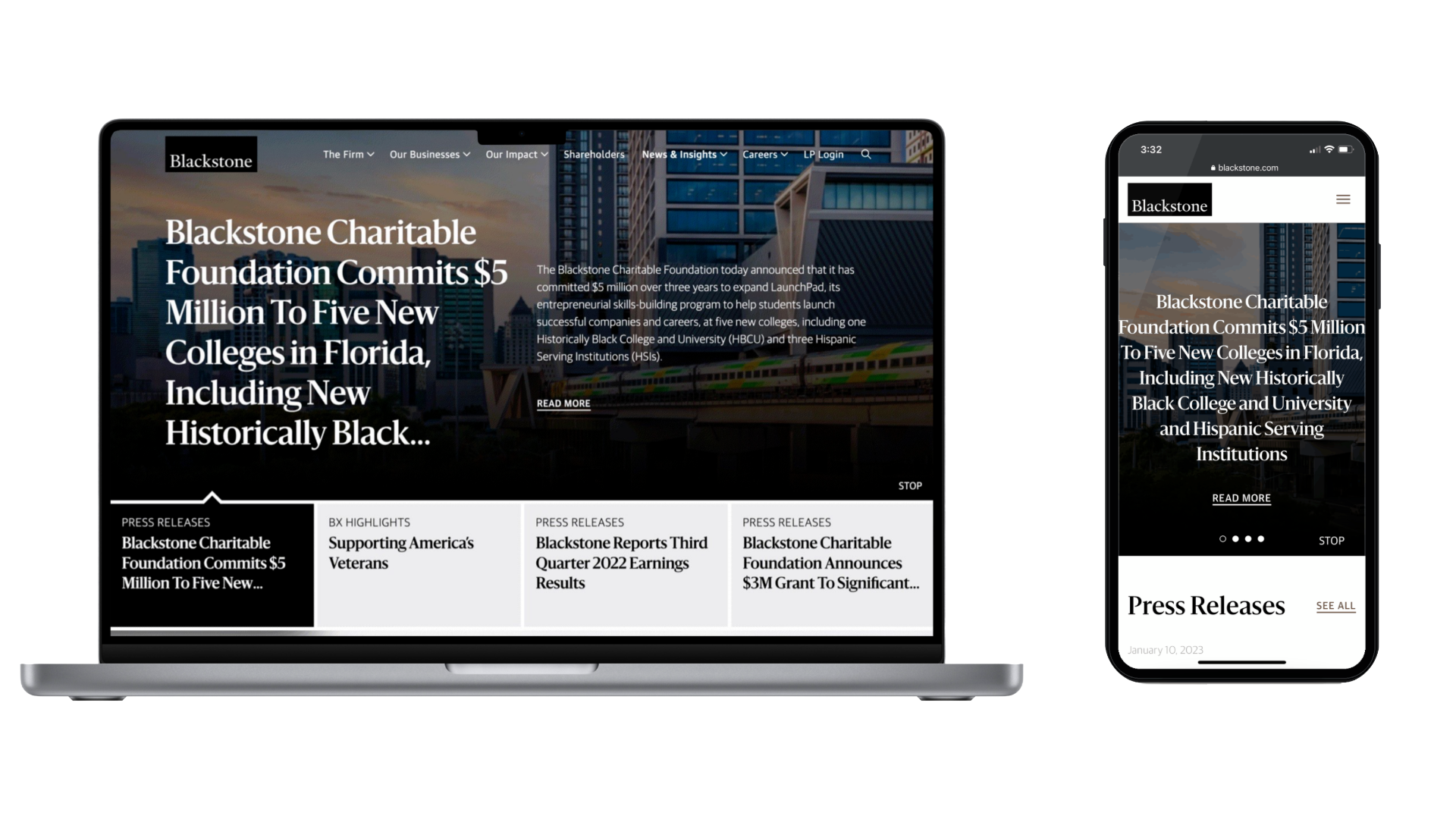
Full primary nav with logo, mega-menu drawer, and search panel. Click any nav menu link to expand its drawer; click the magnifier to reveal the search panel. Only one panel can be open at a time.
Page-bottom navigation. Three-column link list on a black backdrop with the “Build with Blackstone” brand lockup on the left. 1px hairline top and bottom rules.
Variant Catalog (4 Classes)
TB1Horizontal Tab BarUnderline-on-active pattern. Inactive tabs at 0.4 opacity. Mobile is horizontally scrollable, no scrollbar.DOCUMENTED
N1Top Nav (B5 / D2)Guardian Sans 16/24 label + 16×16 chevron-down. Active section: 1px underline spanning text + chevron, weight bump 400 → 500. Hover: chevron rotates 180°, underline slides in left-to-right.DOCUMENTED
N2Sub-Nav (B6)Same anatomy as N1 minus the chevron. 14px text. Used for breadcrumb-row tertiary nav.DOCUMENTED
N3Footer Nav3-col link list on dark backdrop with brand lockup left. 1px top/bottom hairlines. Underline-on-hover sublinks.DOCUMENTED
Behavior Specification
STATE
TEXT
CHEVRON
UNDERLINE
DEFAULT
400 weight (tabs at 0.4 opacity)
Down (0°)
None
HOVER
400 weight + faux-bold via text-shadow (no reflow); tabs lift to opacity 1
Up (180°), 0.25s ease
Slides in left-to-right, 0.25s ease, full link/tab width
ACTIVE / CURRENT
500 weight, opacity 1
Down (0°)
Static, full link/tab width
ACTIVE + HOVER
500 weight
Up (180°)
Static, full link/tab width
EXPANDED (mega-menu open)
500 weight
Up (180°)
Static, full link width
FOCUS-VISIBLE
Inherits state above
Inherits
Inherits + 2px outline 4px offset
Token Reference
KEY
VALUE
CODE
NAV CLASS
.bx-nav-link
class="bx-nav-link"
TAB CLASS
.bx-tabs-demo__btn
class="bx-tabs-demo__btn"
NAV TYPOGRAPHY
Guardian Sans 16/24, 0.32px tracking
font-size:16px; line-height:24px;
TAB TYPOGRAPHY
Guardian Sans 14/21 uppercase, 0.96px tracking
font-size:14px; text-transform:uppercase;
CHEVRON
16×16 SVG, 1.5px stroke, rounded caps, ~90° open V
viewBox 0 0 24 24; d="M4 9l8 6 8-6"
GAP (NAV)
8px between label and chevron
gap: 8px;
GAP (TABS)
64px between tabs
gap: 64px;
UNDERLINE
1px solid currentColor, slides scaleX(0) → scaleX(1) from left
::after { transform-origin: left; }
UNDERLINE TIMING
0.25s ease
--bx-motion: 0.25s ease;
UNDERLINE SPAN
Full link/tab width — text + chevron where applicable